 "ttyymmnn" (ttyymmnn)
06/29/2020 at 10:49 • Filed to: Planelopnik
 1
1
 23
23|
"ttyymmnn" (ttyymmnn)
06/29/2020 at 10:49 • Filed to: Planelopnik | 1
| 23 |
Stolen from Jalopnik, who didn’t bother to credit the source either
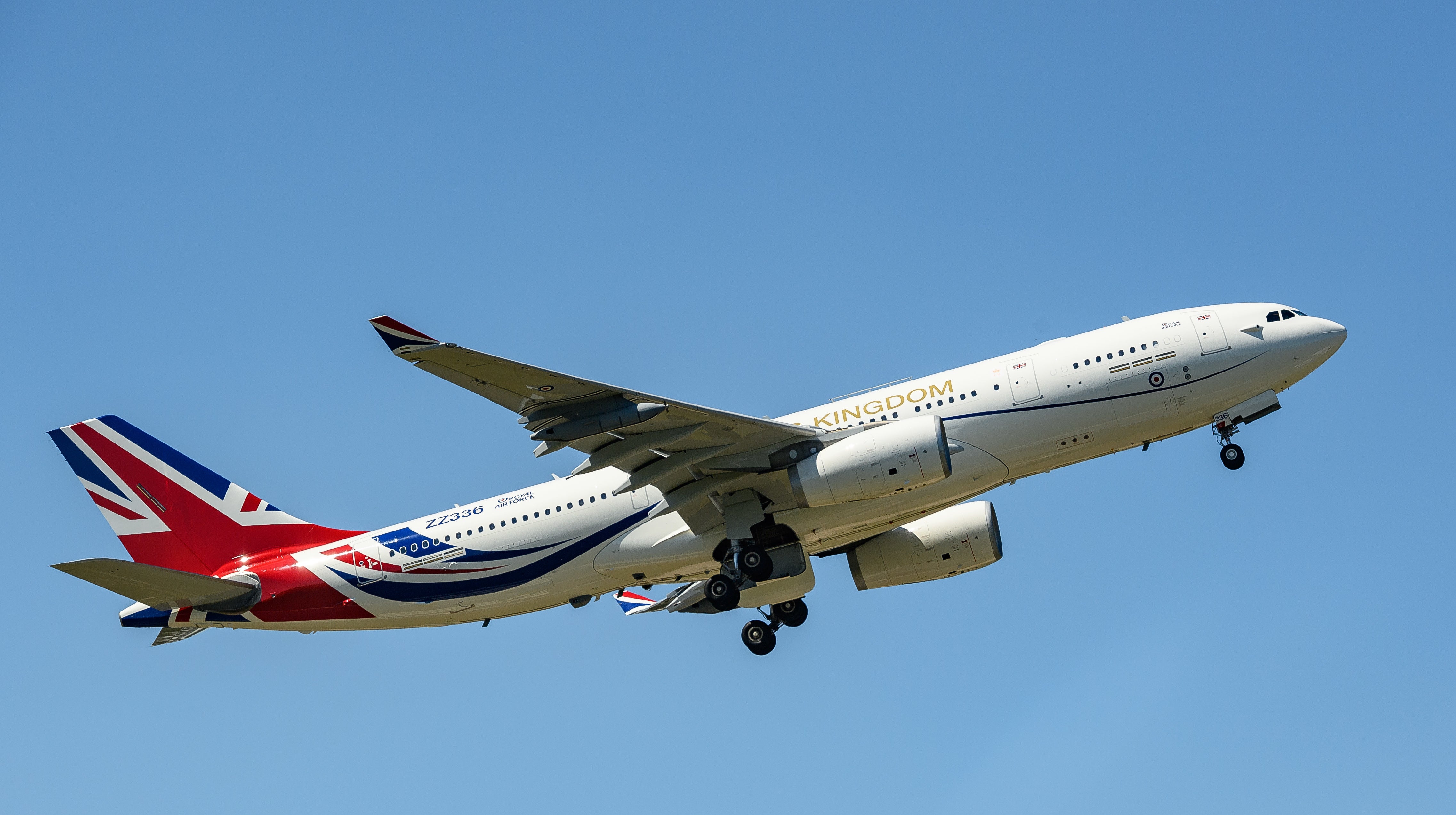
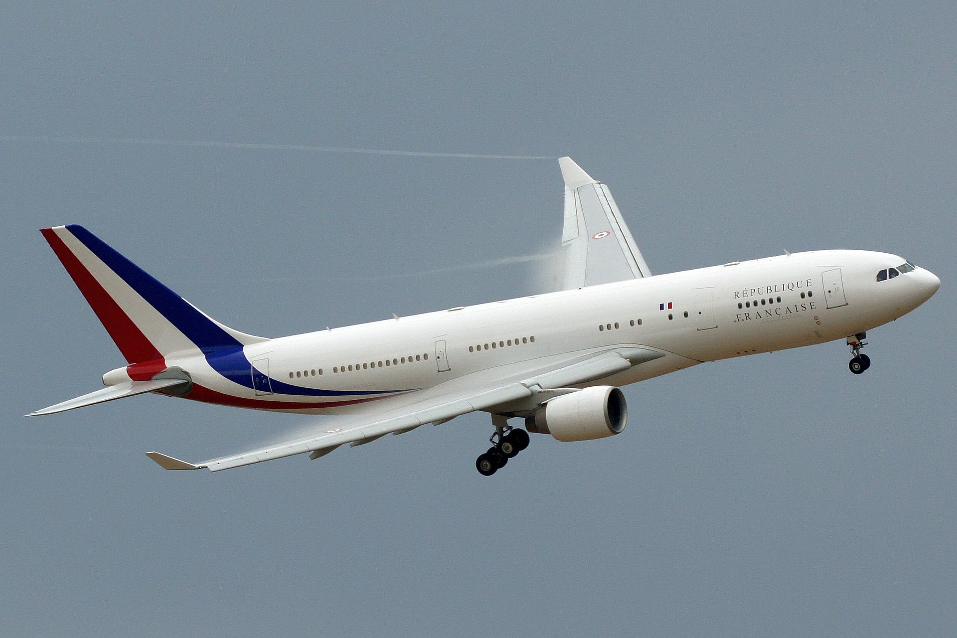
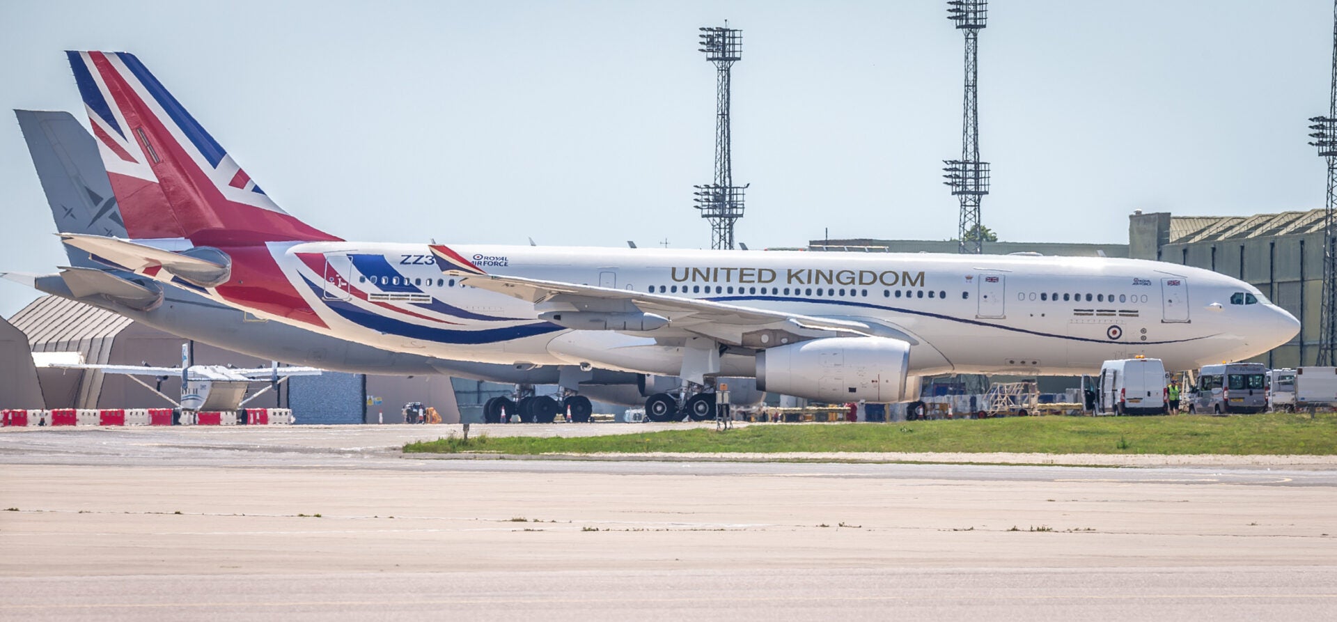
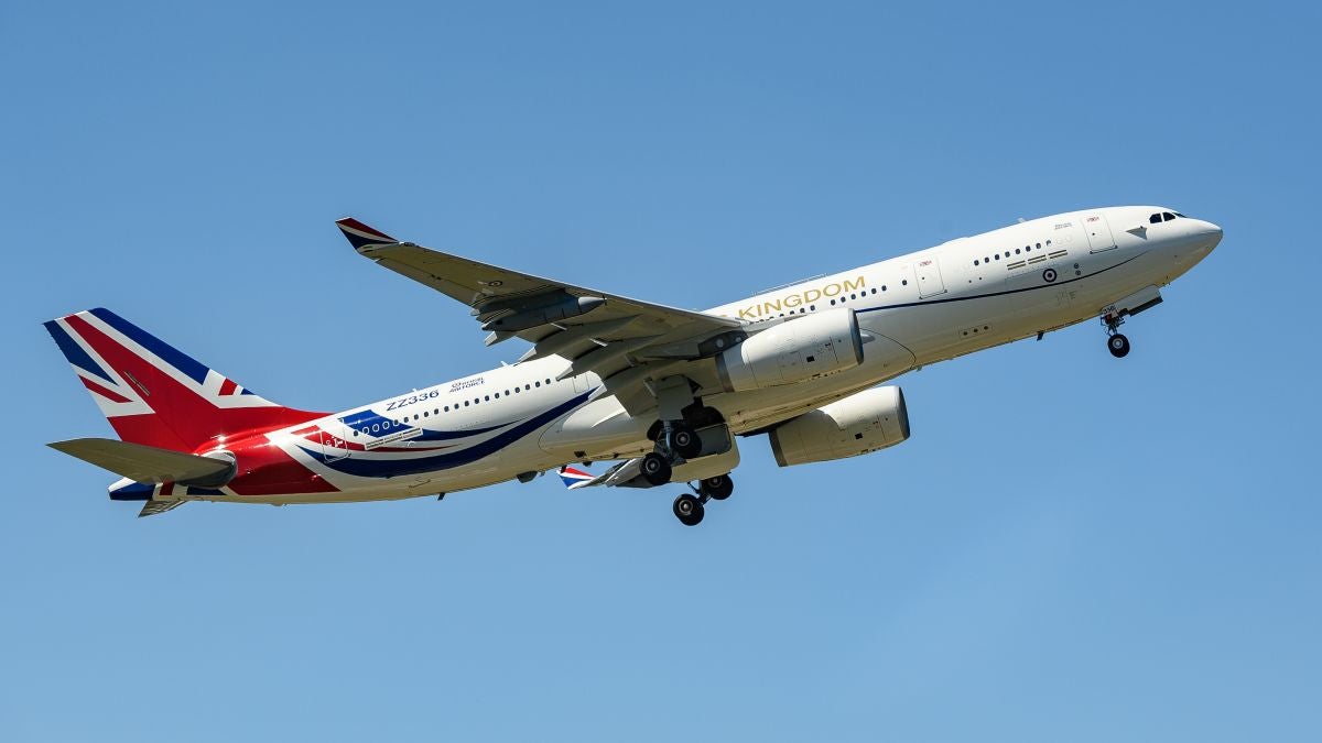
People all over the Internet (not just Jalopnik) have their knickers in a twist over the new livery on the A330 Voyager VIP transport/tanker/airliner. Maybe it’s more over the cost of the Union Jack job over the standard military gray (or is it grey?). I’m trying to understand the hate. I’ve seen much worse, and I think it’s rather attractive.
!!! UNKNOWN CONTENT TYPE !!!
 SBA Thanks You For All The Fish
> ttyymmnn
SBA Thanks You For All The Fish
> ttyymmnn
06/29/2020 at 10:54 |
|
I’m with you... some of the posts I’ve read seem absolutely over-the-top.
I actually like it quite a bit. Since the plane came out of the UK A330 tanker fleet there seemed to be some snark coming from the MoD over it, but the pushback seems to be more over politics than how “attractive” the design was.
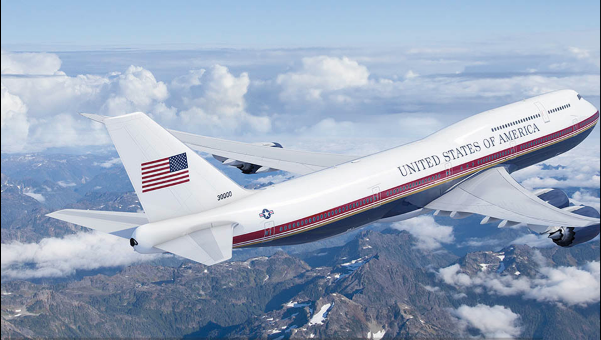
Of course, I don’t mind the new Air Force One livery all that much, either. After 60 years it was probably time.
 Highlander-Datsuns are Forever
> ttyymmnn
Highlander-Datsuns are Forever
> ttyymmnn
06/29/2020 at 10:55 |
|
Should have...
 jminer
> ttyymmnn
jminer
> ttyymmnn
06/29/2020 at 10:57 |
|
I had the same thought - looks fairly sharp if a little bit like a passenger craft livery.
|
ttyymmnn
> SBA Thanks You For All The Fish
06/29/2020 at 10:57 |
|
There is a lot to unpack in the Donald’s decision to rebrand AF1, but I don’t think there was anything at all wrong with the Loewy design. Sure, it’s old, but it’s classic and instantly recognizable. Classy, yet understated, which of course, is everything our president is not. I think it has more to do with the fact that the design arose during the Kennedy administration, and Trump is actively trying to destroy everything his Democratic predecessors did. That A330 looks so much better than the boring-ass airline livery proposed for AF1. It shows the marks of being done by a true artist, not a man with a Sharpie.
|
ttyymmnn
> jminer
06/29/2020 at 10:59 |
|
But still not as airline- y as this:
|
SBA Thanks You For All The Fish
> ttyymmnn
06/29/2020 at 11:08 |
|
Well, I’m skeptical it was done by “a man with a Sharpie” but the other design was still a relic of the 1950's sensibility. Even Don Draper gave up his fedora by the 1970s.
At least Boris’ design incorporates the national color scheme. Although it’s possible Loewy was color blind. That would explain a lot. /s/
|
ttyymmnn
> SBA Thanks You For All The Fish
06/29/2020 at 11:11 |
|
Is my cynicism showing? Sorry, I usually try to be a bit more measured.
 For Sweden
> ttyymmnn
For Sweden
> ttyymmnn
06/29/2020 at 11:21 |
|
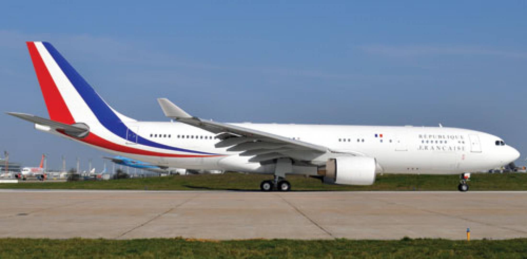
Just like the English, it’s heavily French-inspired
|
For Sweden
> ttyymmnn
06/29/2020 at 11:22 |
|
That is a fantastic livery for a wet-lease charter though
 Svend
> ttyymmnn
Svend
> ttyymmnn
06/29/2020 at 11:31 |
|
I like it.
The tail isn’t too dissimilar to that of the French equivalent.
|
ttyymmnn
> Svend
06/29/2020 at 11:33 |
|
I think honk it’s sharp.
 ranwhenparked
> ttyymmnn
ranwhenparked
> ttyymmnn
06/29/2020 at 12:31 |
|
It looks decent, my only complaint would maybe be that it looks a little too informal, if that’s a thing?
Nothing wrong with flying the flag a little and making more of a statement when you visit, that's kind of one of the points of state airplanes or state yachts, for that matter, it's like a big traveling billboard for the country.
 fintail
> ttyymmnn
fintail
> ttyymmnn
06/29/2020 at 12:34 |
|
One would think the man who wants to “make America great again” (yet he and his devotees can’t give the date to which they want to return) would embrace a timeless iconic design from an era pined for by the me generation . But I suppose we should be happy it isn’t orange and decorated with gilded over-wrought pre-revolution style French furniture.
|
ttyymmnn
> ranwhenparked
06/29/2020 at 12:35 |
|
I see what your’e saying about informal. But I also think that arriving for a summit in what is ostensibly a military airplane doesn’t exactly send the right message.
 Future next gen S2000 owner
> ttyymmnn
Future next gen S2000 owner
> ttyymmnn
06/29/2020 at 12:49 |
|
Whoever gets elected after Trump needs to change that travesty of a livery. It is hideous. It’s jump an inverted Trump livery. Air Force One had a classic paint job that didn’t need updating.
SMDH
 Only Vespas...
> ttyymmnn
Only Vespas...
> ttyymmnn
06/29/2020 at 12:50 |
|
I agree that the Brit Job is attractive...there’s something off about the graphi cs. It’s 2020...the word Kingdom seems like a relic from another time. [ I know it’s their name] Visually, the choice of gold and that typeface cheapen the overall look . It makes the whole thing kind of knock-offy.
|
ttyymmnn
> Only Vespas...
06/29/2020 at 12:54 |
|
Well, Queen Elizabeth is still called the Queen of the United Kingdom of Great Britain and Northern Ireland etc. etc., but I thought I remembered that they were kind of backing away from the whole “kingdom” thing. But like all branding “UK” is pretty well understood, though I would challenge most Americans to tell me what makes up the UK.
|
ttyymmnn
> Future next gen S2000 owner
06/29/2020 at 12:55 |
|
I have a feeling that the AF is slow walking this one, hoping for a change of direction in November.
please, please, please, please....
|
ttyymmnn
> fintail
06/29/2020 at 12:57 |
|
I guess I’m responsible for turning this into another Trump referendum, which was not my intention. That said, I believe the man is such an egomaniac that he has to put his mark on everything he touches.
|
fintail
> ttyymmnn
06/29/2020 at 13:03 |
|
I see nothing wrong with bring critical or at least suspicious about the change, especially given the regime behind it . A design doesn’t need to change simply because it is old, and the prior design was dignified and timeless . One can easily question the motive for the change given so much of what else is going on right now.
Some here, however, like to play a weird devil’s advocate game in support of the corrupt shitshow (even to the point of using terms like “TDS”), so they should probably be taken with a grain of salt.
|
ranwhenparked
> ttyymmnn
06/29/2020 at 13:06 |
|
Oh, no doubt, this makes way more sense than the normal RAF markings used before.
|
ranwhenparked
> ttyymmnn
06/29/2020 at 13:59 |
|
The only thing I can say about that is its... fine... that's all, just fine. Bland, obvious, not especially creative, but not terrible. If Air Force One had looked like that all along these last 60 years, no one would think anything of it. But that's it, nobody would think anything of it, good or bad. The powder blue scheme is unique, distinctive, unmistakable, the new one would work just as well for any country with a red, white, and blue flag, of which there are many. It's generic.
 Distraxi's idea of perfection is a Jagroen
> ttyymmnn
Distraxi's idea of perfection is a Jagroen
> ttyymmnn
06/29/2020 at 16:45 |
|
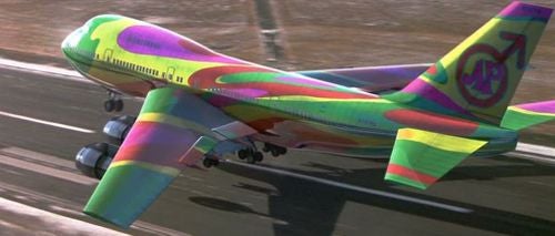
My main issue with it is it looks too much like a BA rebrand. Although in fairness to them, it’s hard to avoid that if you want to stick the Union Jack on there. Short of going full Austin Powers, which is an idea with.....merit.